“万物之始,大道至简,衍化至繁。”——《道德经》
“At the beginning of all things, the road is simple and the evolution is complex.” ——《Tao Te Ching》
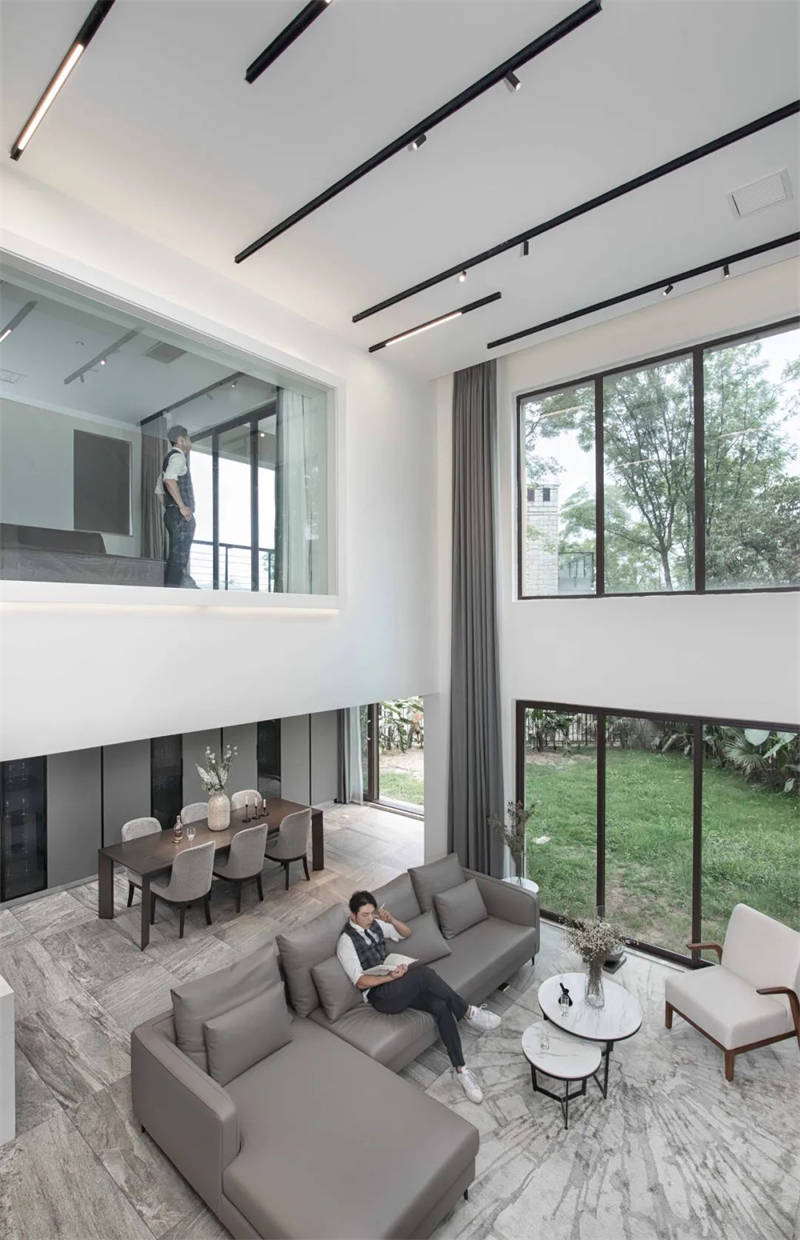
极简也是这样,与传统经典不谋而合,以简单到极致为追求,感官上简约整洁,品味和思想上更为优雅。虽简约,却不简单。
Minimalism is also like this, which coincides with traditional classics. It pursues simplicity to the extreme. It is simple and clean in sense, and more elegant in taste and thought. Simple as it is, it is not simple.
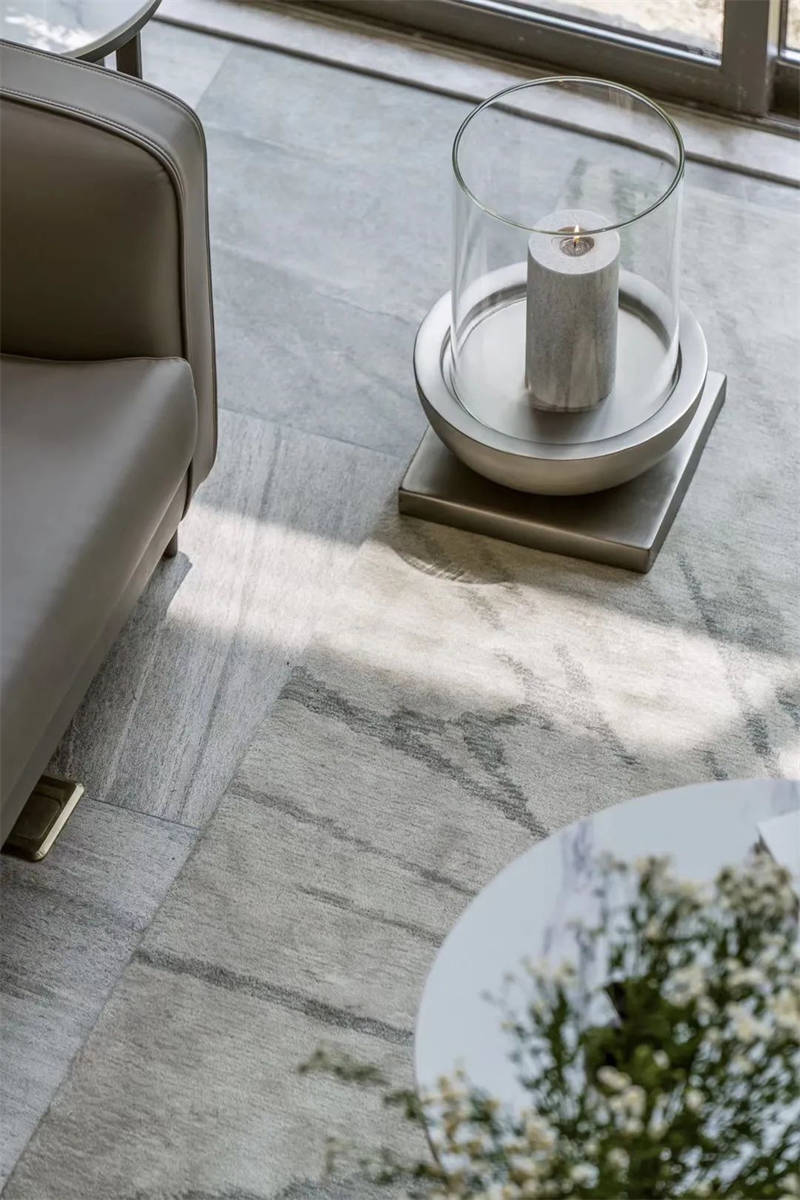
设计之初,设计师的本质想法是设想宁静空间,但又存有温暖和真实感。所以主色调选择了白色,白色总是给人最简单的幸福。家具到装饰,则选择了灰色调,让居室看起来干净清爽,渗透人心。如何做出更有品味的极简设计。下面我们通过这个案例来告诉大家。
At the beginning of the design, the designer’s essential idea is to imagine a quiet space, but there is warmth and realism. So the main color is white, which always gives people the simplest happiness. Furniture to decorate, chose gray tone, let bedroom look clean and fresh, permeate people’s heart. How to make more tasteful minimalist design. Now let’s tell you through this case
▼客厅
A LIVING ROOM
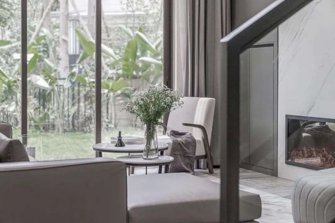
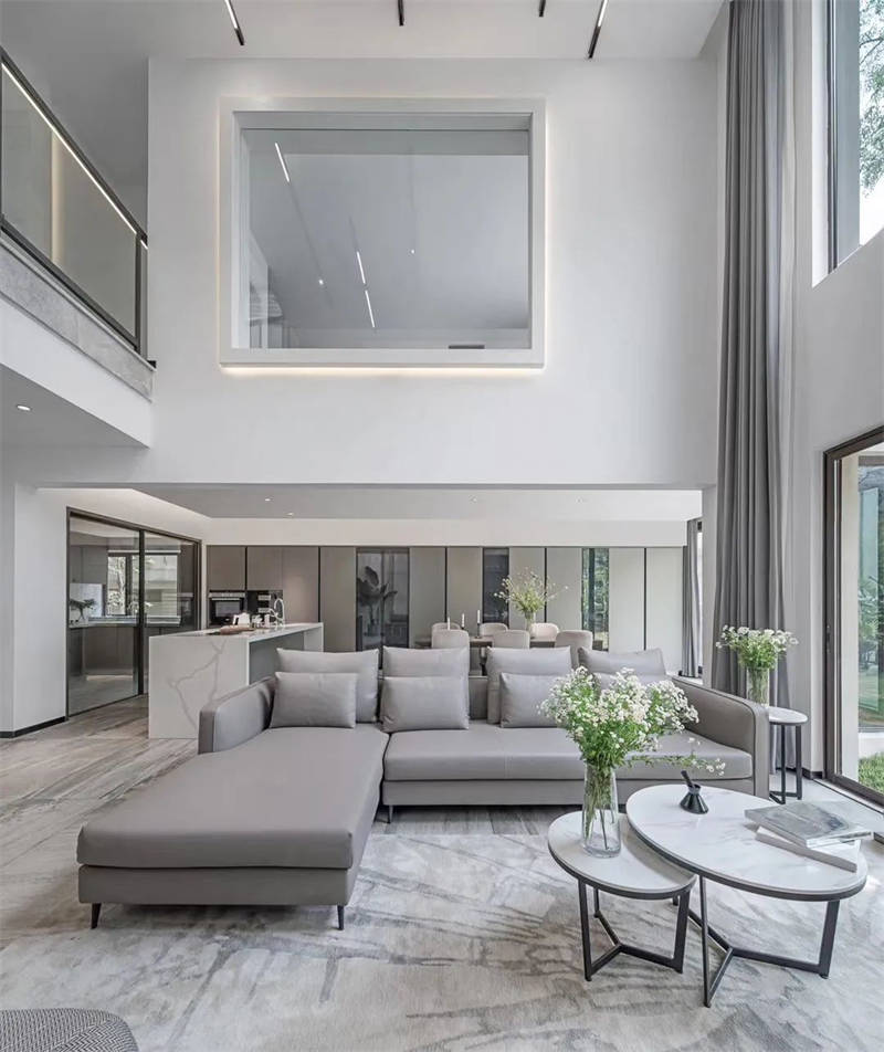
客厅 使用开放式设计,采用白色和浅灰色作为主要配,并以黑色的线条穿插,在加上客厅是无主灯的设计,让自然光有更好的漫散射,使得光影更具自由感,使整个空间呈现的干净纯洁感。浅灰色的布艺沙发搭配上前方的大理石壁炉,打造简约轻奢的高级质感。家具、灯具、饰品点染其中,形成静逸脱俗的意境之美。
The living room uses the open design, uses white and light gray as the main match, and intersperses with black lines. In addition, the living room has no main light design, which makes the natural light have better diffuse scattering, makes the light and shadow more free, and makes the whole space clean and pure. The light gray fabric sofa matches the marble fireplace in front to create a simple and luxurious high-level texture. Furniture, lamps and ornaments are dyed to form the beauty of artistic conception.
▼入户玄关
Entrance entrance
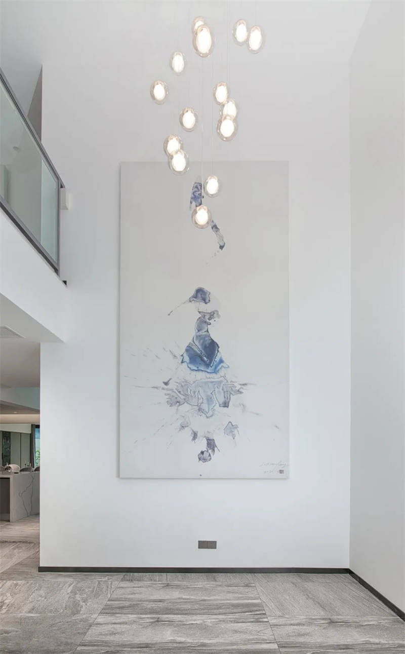
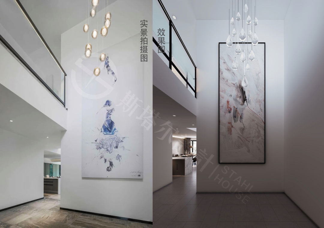
入户玄关 零星的悬吊水晶灯,折射出点滴光晕搭配艺术家李晓峰老师的亲笔之作——浴火重生,使空间氛围更加沉稳。
The sporadic suspended crystal lights in the entrance porch reflect a bit of halo, which is combined with the work of artist Li Xiaofeng’s teacher – rebirth from the fire, making the space atmosphere more stable.
▼ 客餐厅
LIVING ROOM RESTAURANT
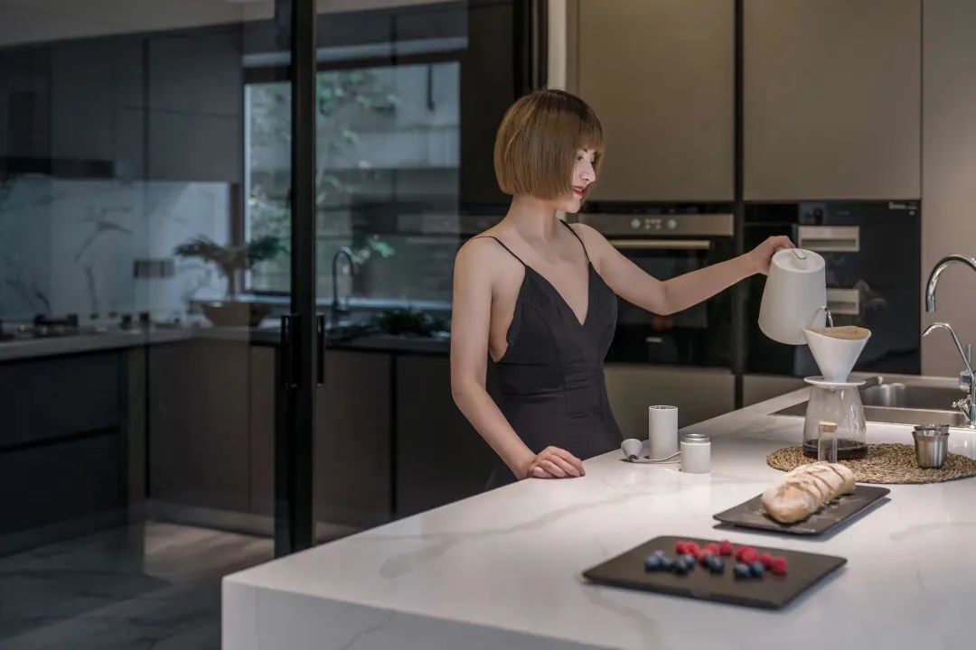
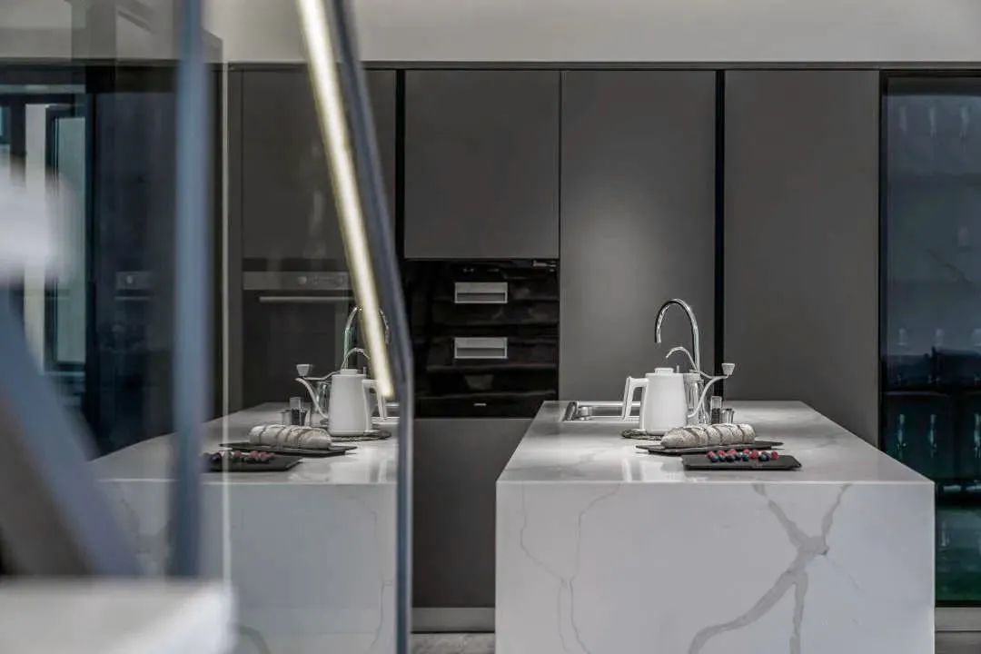
餐厅 位于窗前,与客厅相邻窗外的绿植生机勃勃,充足的光线透过窗户照进室内,给人明亮的视觉感受。餐桌选用浅木色实木餐桌,疏密有致的自然纹理搭配上极简的外形,简约而精致。餐椅与吊灯的造型富有设计感。
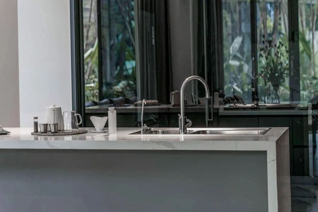
厨房 也位于开放空间中,白色橱柜搭配上白色大理石,十分有质感。岛台上方的金属吊灯与岛台下方的深木色相互呼应,沉稳有格调,展现出厨房的精致轻奢气息。
Kitchen is also located in the open space, white cabinets with white marble, very texture. The metal chandelier above the island platform and the dark wood color below the island platform echo each other, calm and elegant, showing the delicate and luxurious flavor of the kitchen.
▼ 楼梯
STAIRS
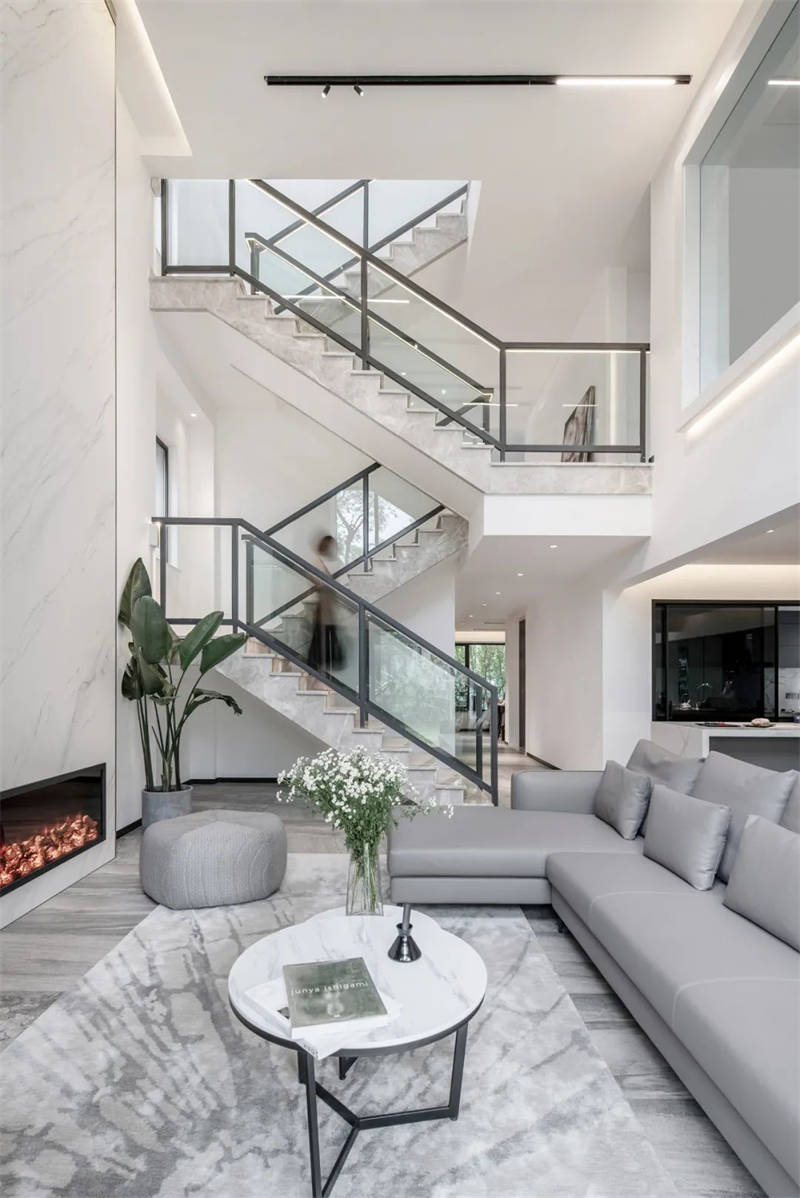
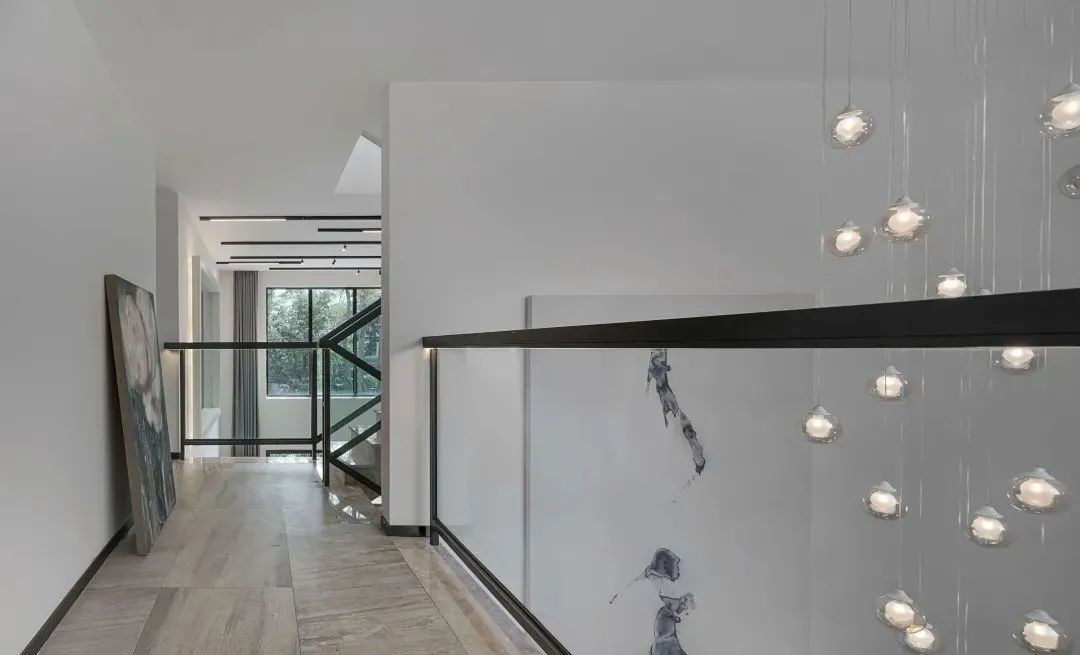
楼梯 处也极富设计感,木色的楼梯搭配透明玻璃,再与白色大理石拼接,楼梯旁错落有致的白色吊灯,简约的设计营造出这个空间的高级感。
The staircase is also full of design sense. The wood color staircase is matched with transparent glass, and then spliced with white marble. The white chandeliers beside the staircase are arranged in an orderly way. The simple design creates a high-level sense of the space.
▼ 主卧
BEDROOM
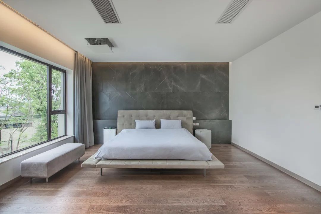
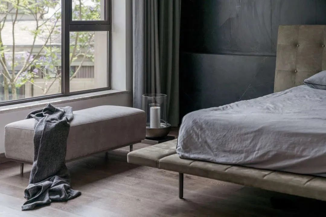
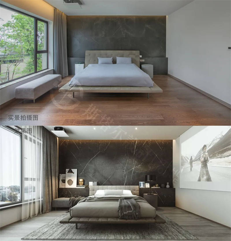
卧室 依旧延续极简设计,以深灰色作为主要配色,打造静谧的休息空间。黑色岩板与原木色地板的反差,将自然界两种截然不同的元素,融入同一空间而变得协调柔软。衣帽间与卧室相邻,深灰色的橱柜搭配镶黑边的玻璃,再加上黄色灯光,很好的展现了精致高级的极简风。
The bedroom still continues the minimalist design, with dark gray as the main color, creating a quiet rest space. The contrast between the black rock board and the log color floor integrates two different elements of nature into the same space and becomes harmonious and soft. Cloakroom and bedroom adjacent, dark gray cabinet with black edge glass, plus yellow light, a good show of exquisite high-grade minimalist style.
▼ 卫浴
BATHROOM
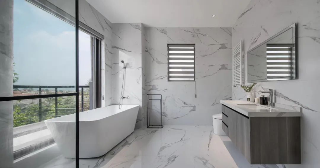
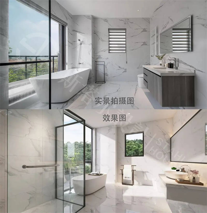
卫生间 选用白色和浅灰色配色,干湿分离的布局合理。白色的大理石营造轻奢气息。浴缸位于窗前,拥有开阔的视野,明亮的光线打造干净纯粹的空间氛围。
White and light gray color matching are selected for toilet, and the layout of dry wet separation is reasonable. White marble creates a light and luxurious atmosphere. Located in front of the window, the bathtub has a wide view and bright light to create a clean and pure space atmosphere.
▼改造对比
Transformation comparison
▼ 户型图
Apartment layout diagram
一层
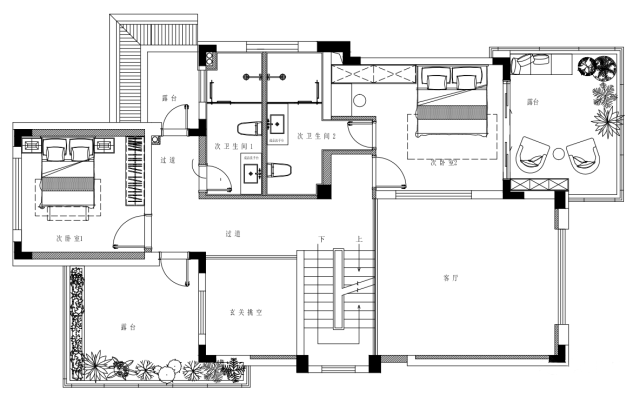
二层
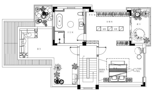
三层
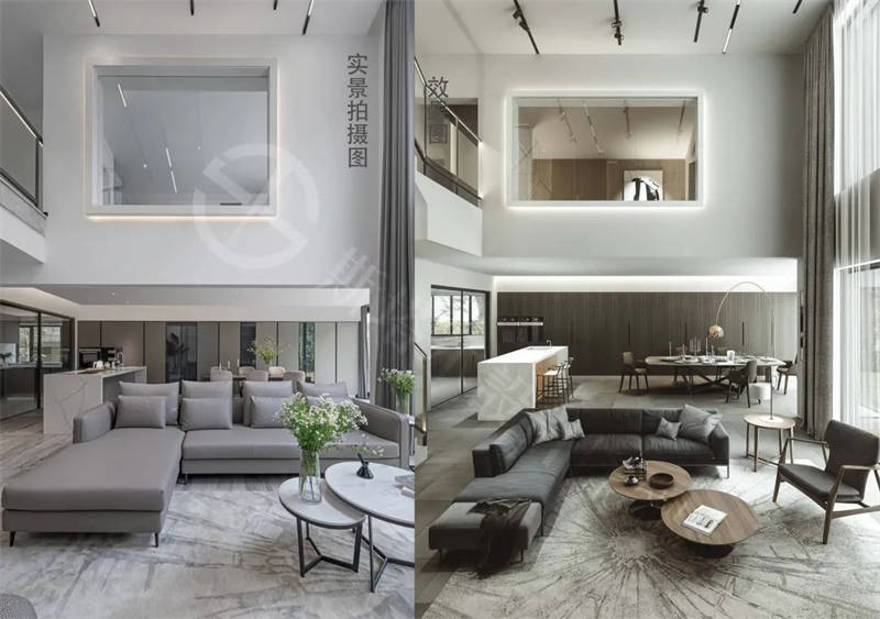
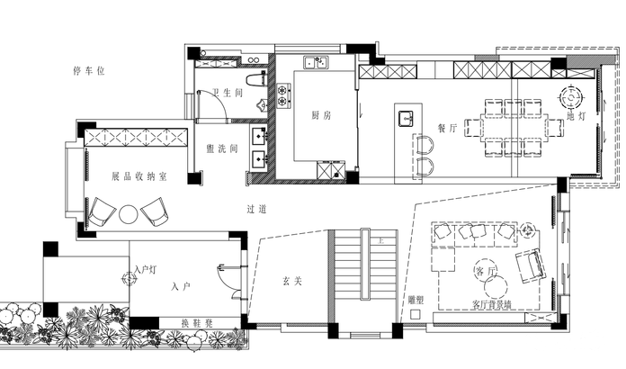
缺陷:入户内门厅过小空间闭塞不实用。改变楼梯的方向可以增加门厅的空间感和实用性。7m的开间让客餐厅在一条线上使用有紧凑的感觉,且空间满而不开阔,对家具的选择体量也有限制。厨房面积过小,使用功能受到影响,需要在餐厅做为补充。
改造之后:在空间布局上,整个空间通透明亮,空间规划具有穿透性和流动性的同时,又保持着不同空间的区域完整性,让视线随着串联的空间顺势展开。顶面极具张力的黑色线条和暗藏式灯带的应用,使整个空间呈现出纯净、灵动、流畅的简约之美。客餐厅空间都敞扩,互动性强也不受干扰,门厅和过道、楼梯间融为一体,化零为整使空间效果最大化。增加品茗区和西厨区提高生活品质感,更适合一家人的情感交流。
Project name | design of Huanglong Valley single family villa
Project address | Chengdu, China
Design Institute | starrhouse design
The project area is 300 m2
设计事务所简介:
斯塔尔设计,前身是SuLei个人工作室。经过12年的积累与沉淀,在整合多方面的人才及材料资源后,于2019年正式以斯塔尔豪斯空间设计的形式为客户提供更加全面的专业设计及材料服务。
团队成员包括艺术家、风水学家、设计师和材料专家,为客户提供建筑设计、室内设计、园林设计、定制家具设计、软装设计、灯光设计服务,以及各种家具及装饰材料的生产及代采购服务。






没有回复内容